Today, we’re excited to officially unveil the logo of WordCamp Rajasthan!
This logo is more than just a visual identity for the event; it carries a story deeply rooted in Rajasthan’s culture, traditions, and welcoming spirit.
Where the Journey Started
While designing the logo, we explored multiple ideas that could represent Rajasthan and its rich cultural identity.
Some of the initial concepts included:
- Popular monuments of Rajasthan
- The beauty of the desert landscape
- Camels, which are closely associated with Rajasthan
- Ornamental styles inspired by traditional Rajasthani elements
- Traditional Rajasthani arches (Jharokha-inspired designs)
Each concept beautifully represented Rajasthan in its own way, and every idea helped shape the creative journey behind the logo.
Why We Chose Mandana Art
As we continued exploring different directions, one idea stood out the most: Mandana (मांडना).
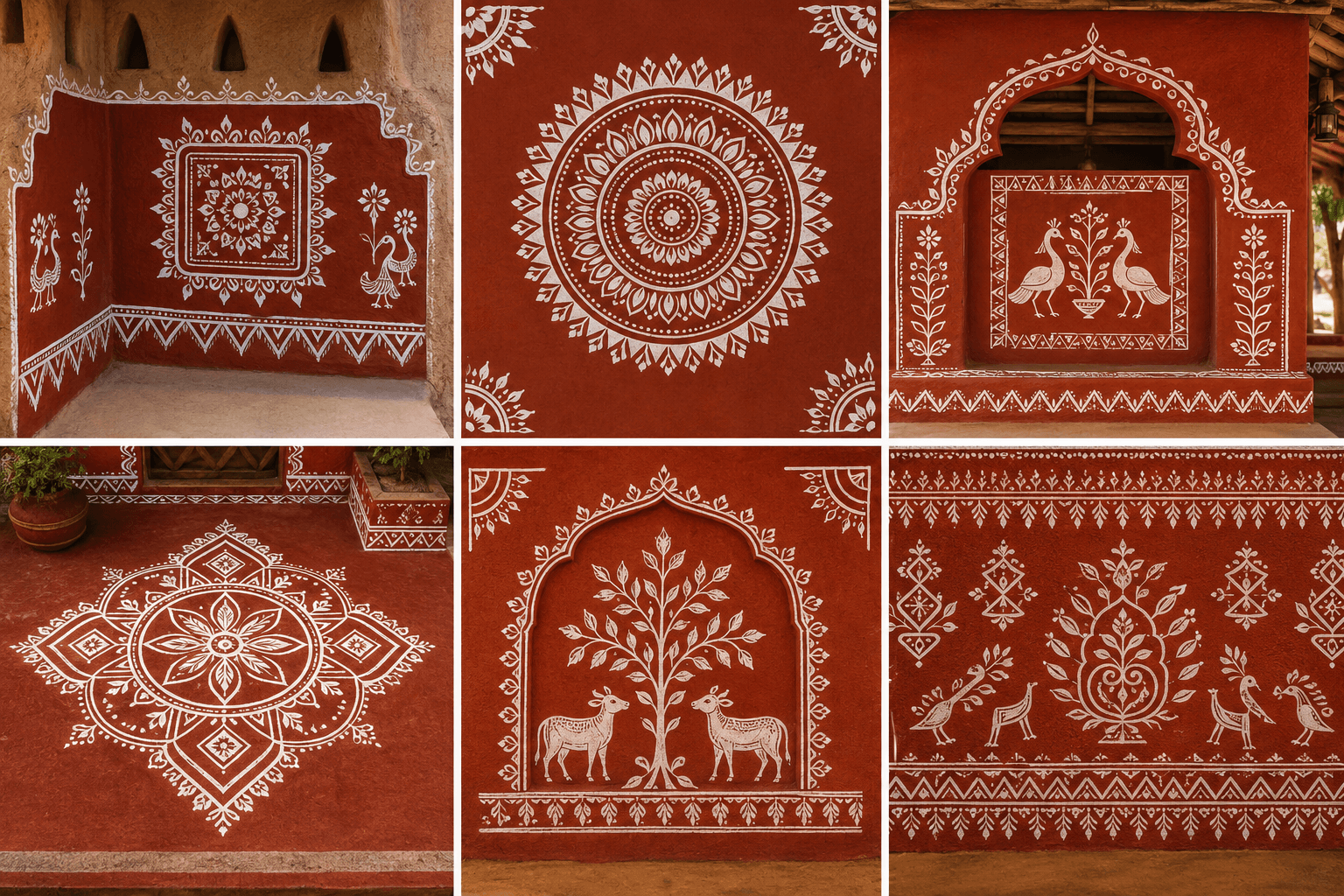
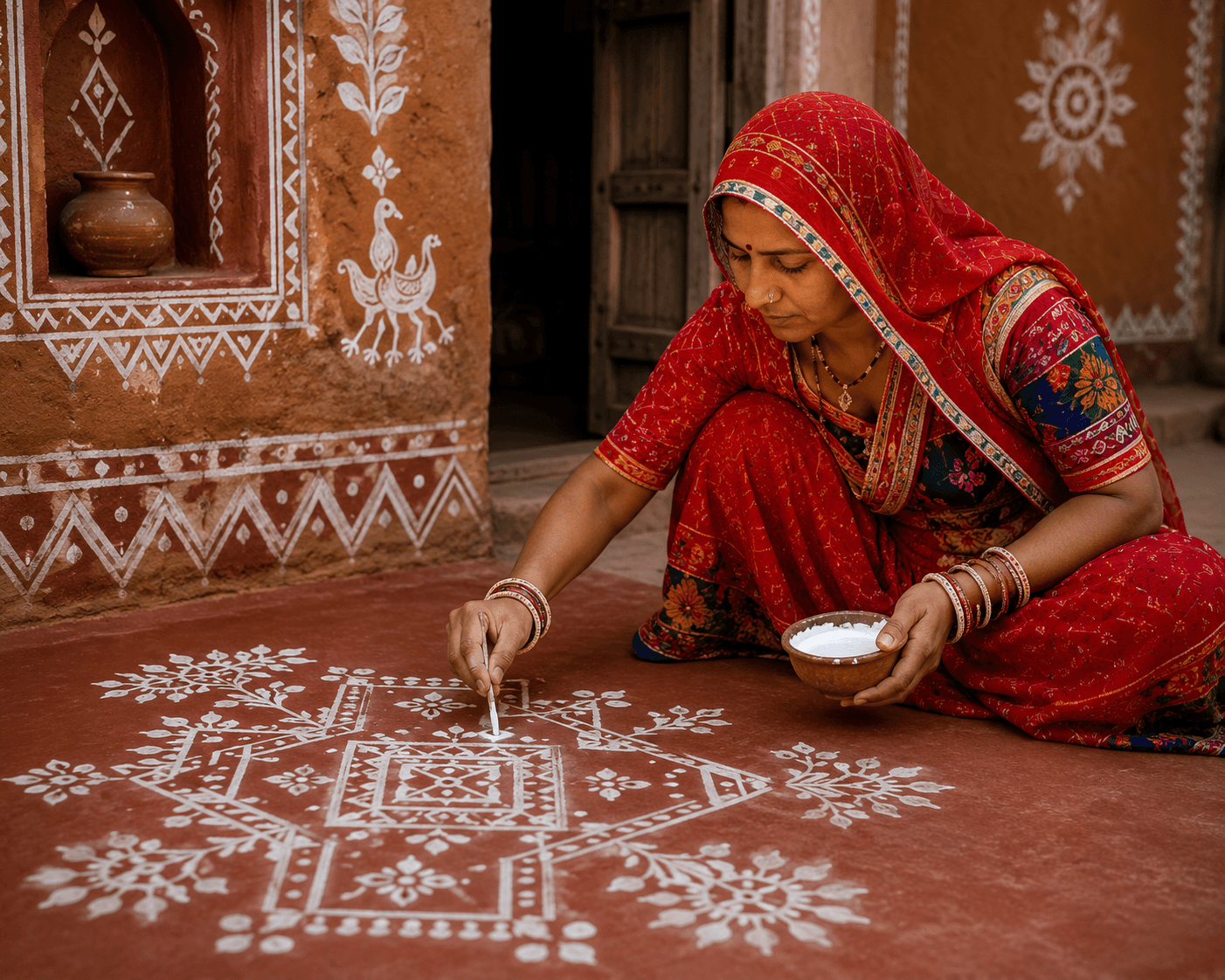
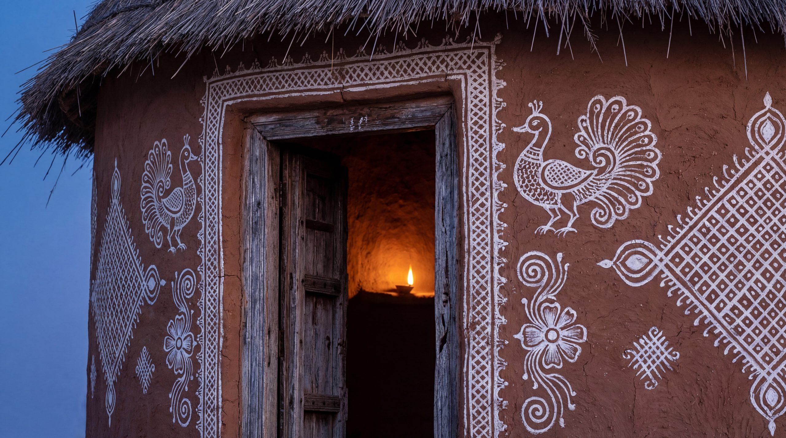
Mandana is a traditional folk art form of Rajasthan that has been practiced for generations.
In earlier times, when decorative resources were limited, the women of Rajasthan would create beautiful Mandana patterns on the walls and courtyards (आँगन) of their homes using simple natural materials.
But Mandana was never just about decoration.
It represented warmth, creativity, celebration, and hospitality.
Whenever guests arrived at a home, the first thing they noticed was the beautifully decorated entrance and courtyard, a heartfelt way of welcoming people.
And that feeling perfectly aligned with what WordCamp represents: community, openness, creativity, and bringing people together.
More Than Rangoli: The Story of Mandana Art
At first glance, the Mandana-inspired elements in our logo may remind some people of Rangoli, and that resemblance is natural. Both art forms are deeply connected to India’s tradition of welcoming guests, celebrating occasions, and bringing communities together.
However, their visual styles are quite different.
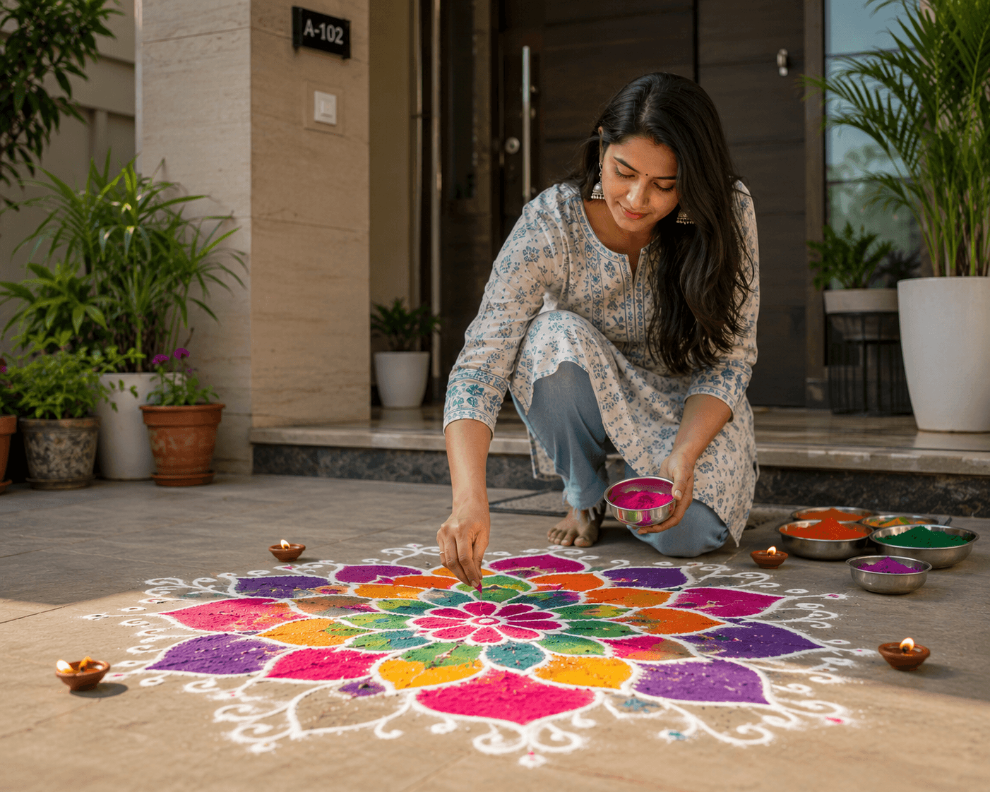
Rangoli is often known for its vibrant colors and festive decorative patterns. Mandana, on the other hand, carries a more earthy, minimalist folk-art character rooted in Rajasthan’s rural culture.
Traditionally created using white patterns on red clay surfaces, Mandana art is recognized for its geometric balance, symmetry, floral motifs, and handmade expression.
For the WordCamp Rajasthan logo, we intentionally drew inspiration from this Mandana style. The earthy tones, white linework, and traditional motifs help the logo reflect Rajasthan’s cultural warmth while keeping the design clean, modern, and adaptable for WordCamp branding.
So while the design may feel familiar to those who associate it with Rangoli, its artistic foundation is deeply rooted in Mandana, a folk art form that beautifully represents Rajasthan’s heritage and welcoming spirit.
Bringing That Emotion into the Logo
That very emotion became the inspiration for the final WordCamp Rajasthan logo.
Just like Mandana art welcomed guests into homes across Rajasthan, we wanted the logo to reflect the welcoming spirit of the WordPress community.
The design blends Rajasthan’s cultural identity with the collaborative and creative energy of WordCamp.
Through the patterns and style, the logo represents community, connection, learning, and togetherness – values that truly define WordCamp.
A Design Rooted in Rajasthan
With this logo, our goal was to create something that feels deeply connected to Rajasthan while still representing the modern and open spirit of the WordPress ecosystem.
It is a celebration of culture, creativity, and community coming together.
Special Thanks ❤️
A heartfelt thanks to our designer, Mohit, for creating such an exceptionally beautiful logo and perfectly bringing this vision to life.
The creativity, attention to detail, and cultural touch in the design made the logo truly special, and we’re incredibly grateful for the effort and thought behind it.
Finally, It’s Here!
We’re very happy to finally share the WordCamp Rajasthan logo with all of you, and we hope the story behind it makes it even more meaningful.
We can’t wait to continue this journey together with the amazing WordPress community. 🚀